
Stepping Back (Spilling Ink #10)
Spilling Ink is the monthly newsletter from from Curious Squid, Dan Brown’s IA and UX design agency based in Washington, DC


Information architecture is fundamentally a design activity: making decisions about the structure of an experience to achieve an objective and meet a need.
Like any design effort, the iterations might take you to something that isn’t quite right. Maybe you need to revisit because of new considerations. Or maybe your initial iterations sent you on a path that took you too far afield. Whatever the reason, design efforts sometimes require the team to take a step back.
In IA, it’s also helpful to unwind the myriad decisions that brought you to your current iteration. This means separating out the big decisions so the team can consider them individually.
In designing a navigation system for a set of software products recently, my client and I had to accommodate some new inputs, compelling us to revisit the decisions we had made until that point. There were three main decisions:
The 6 different schema to categorize the content
Of those, the 2 schema we decided to use in the menu we were designing
And the layout of that menu
The menu had already been through a round of testing, but in light of the new inputs we needed to separate out each of these things so we could determine what wasn’t working. Was this a question of layout, or was there something going on with the categorization schemes we chose?
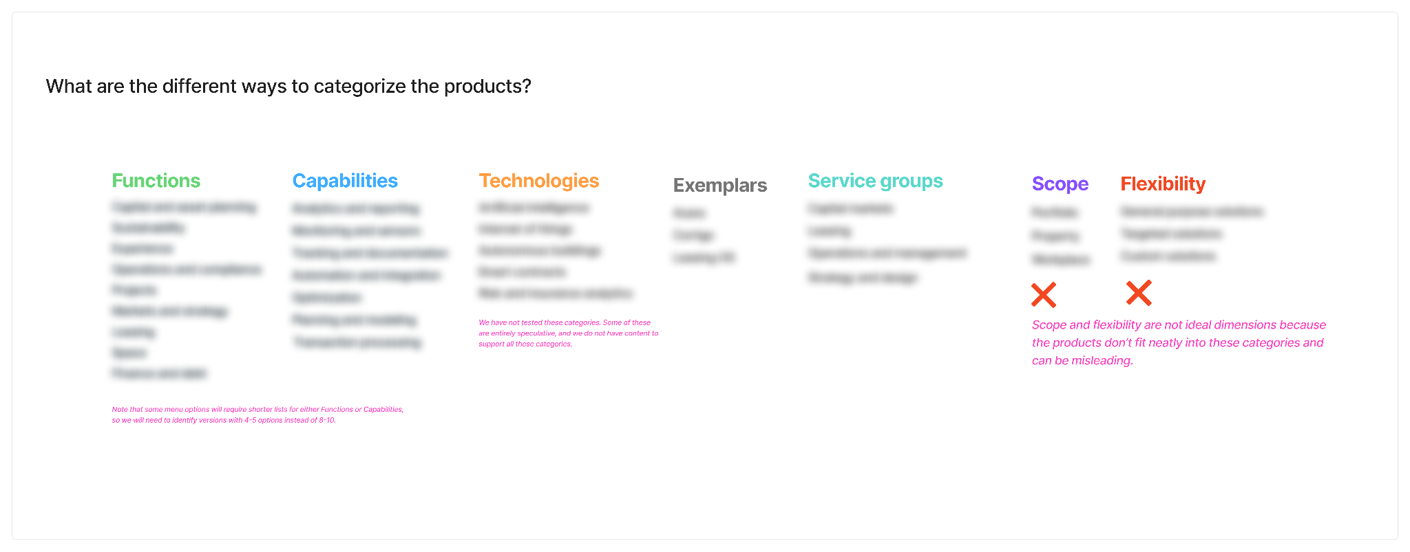
Categorization schemes
I captured the six different categorization schema we had been considering, and gave them labels. We could categorize the software by where it fit into the business, for example, so one of the schemes was called “functions”.
Another categorization scheme was “capabilities,” which was a list of core functionality, like “analytics” and “planning”. Any piece of software could be categorized by its function and its capabilities. There were several other categorization schemes, including the technologies used in the products, the services they supported, and the scope of its functionality.
I see these as different ways of telling the story because a menu design can’t do all these things at the same time. Menus provide way-finding for web site visitors, of course, but they also do so in an opinionated way. Visitors to the site depend on navigation menus to explain what’s available in a way that is coherent and meaningful.
For my client, we had landed on functions as the way to tell that story. But new inputs implied a need to revisit that decision. To help facilitate that conversation, I spelled out the range of categorization schemes, why we had chosen Functions, and why we had explicitly rejected some of the others.
Menu layout
But that wasn’t the only decision that went into the latest iteration. We had also determined the layout of the menu – how the menu would present the categorization scheme.
To evaluate this decision, I assigned each categorization scheme a color. (For example, Functions was green.) I then made block diagrams of the menus to show the range of layouts and how we might present two or three different categorization schemes within the menu.
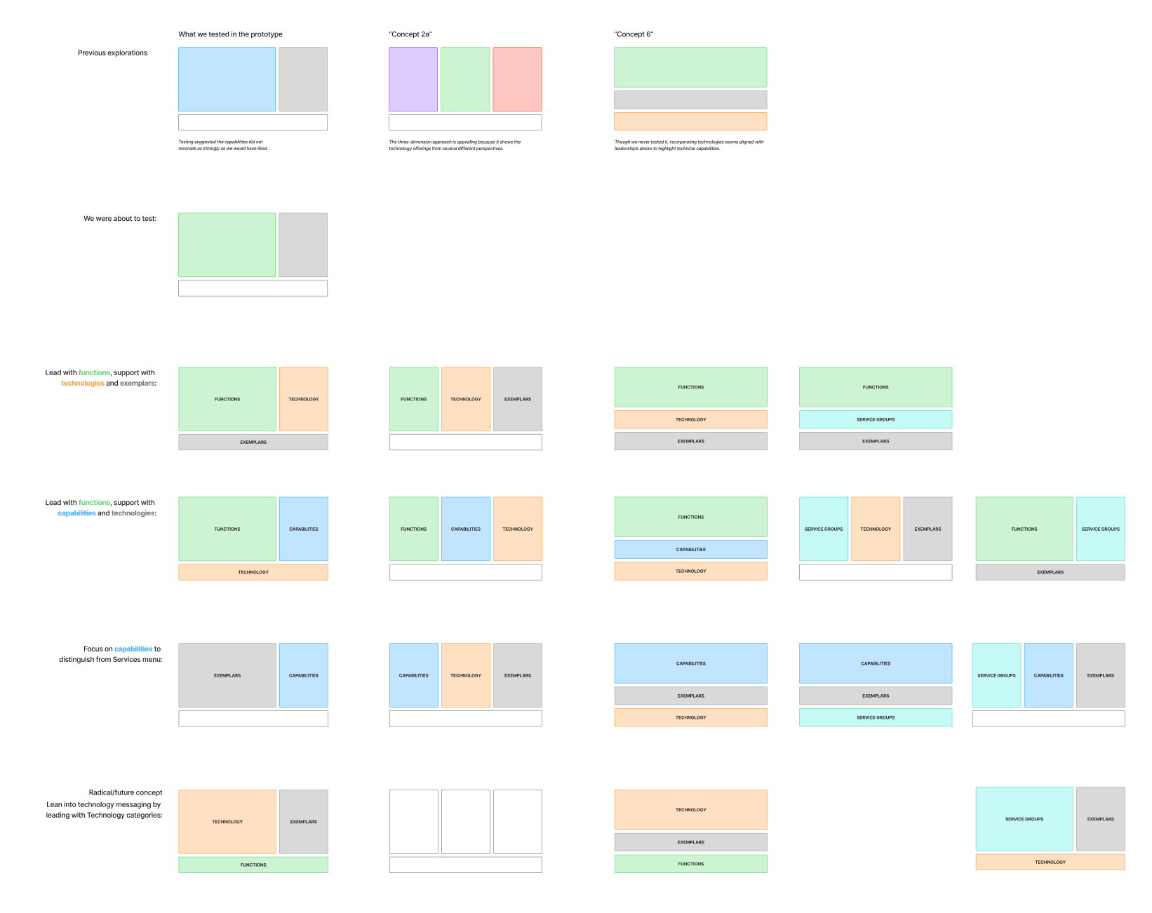
There were really three different approaches to laying out the menu. From left to right:
2:1 columns, 1:1:1 columns, and 2:1 rows. Every menu has a CTA/promotion bar across the bottom – important to the story but not essential to capturing the structure.
Each layout has different strengths. The 2:1 columns is a favorite of mine because it allows us to prioritize one categorization scheme and still incorporate a second scheme. This second scheme is there to rescue users who may not resonate with the main scheme.
The three-column approach is useful if you’ve got concise categorization schemes that offer vastly different ways of inviting visitors into the content. But with so many different categories baked into a single menu, it can also introduce the paradox of choice, especially if users are navigating a space of unfamiliar items. Use with caution.
Stepping back
With the elements of the menu broken apart, we could step back and look at the different approaches. Every menu is a combination of three decisions:
What categorization scheme to put in the menu
Which layout to display the schemes
How the categories are prioritized within the layout
My client and I discussed each decision independently, like whether we wanted to use the Functions categorization scheme or switch to the Capabilities scheme. Focusing on one decision at a time allowed us to clearly articulate the rationale for that decision, and perhaps more importantly what led us to reject the other options.
After an initial review, we landed right back where we were. Some may say this was a waste of time, but in design there is value in anything that can reinforce a decision, or help the team internalize the rationale.
But the journey isn’t done. A few more new requirements emerged – a situation that probably deserves its own article – and we iterated further, landing on an entirely new approach. The constraints drove us to identify a new categorization scheme and change up some wording. The exploration got us to a place both my client and I found compelling, even if the stakeholders find the approach risky.
Stepping back – that is, breaking down the decisions and looking at the range of options you previously rejected – allows the team to build more confidence in their existing decisions or find new alternatives.
Thanks for reading!
Spilling Ink is the (sorta) monthly newsletter from from Curious Squid, Dan Brown’s IA and UX design agency based in Washington, DC.
Unchecked is the monthly podcast about disinformation and the role designers must play in creating more resilient information spaces.