
Games as information systems (Spilling Ink #11)
Spilling Ink is the monthly newsletter from from Curious Squid, Dan Brown’s IA and UX design agency based in Washington, DC

Can the structure of a board game help us design information systems?
Probably not, but let’s ride this out for a few hundred words and see how it goes.
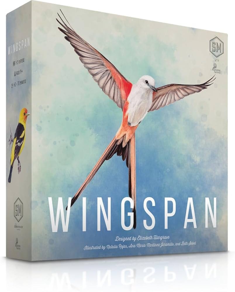
At Taxonomy Bootcamp I appeared on a panel about taxonomies and boardgames. My fellow panelists and I dug into the taxonomy of Wingspan, a popular boardgame about birds. The game was designed by Elizabeth Hargrave and published by Stonemaier Games.
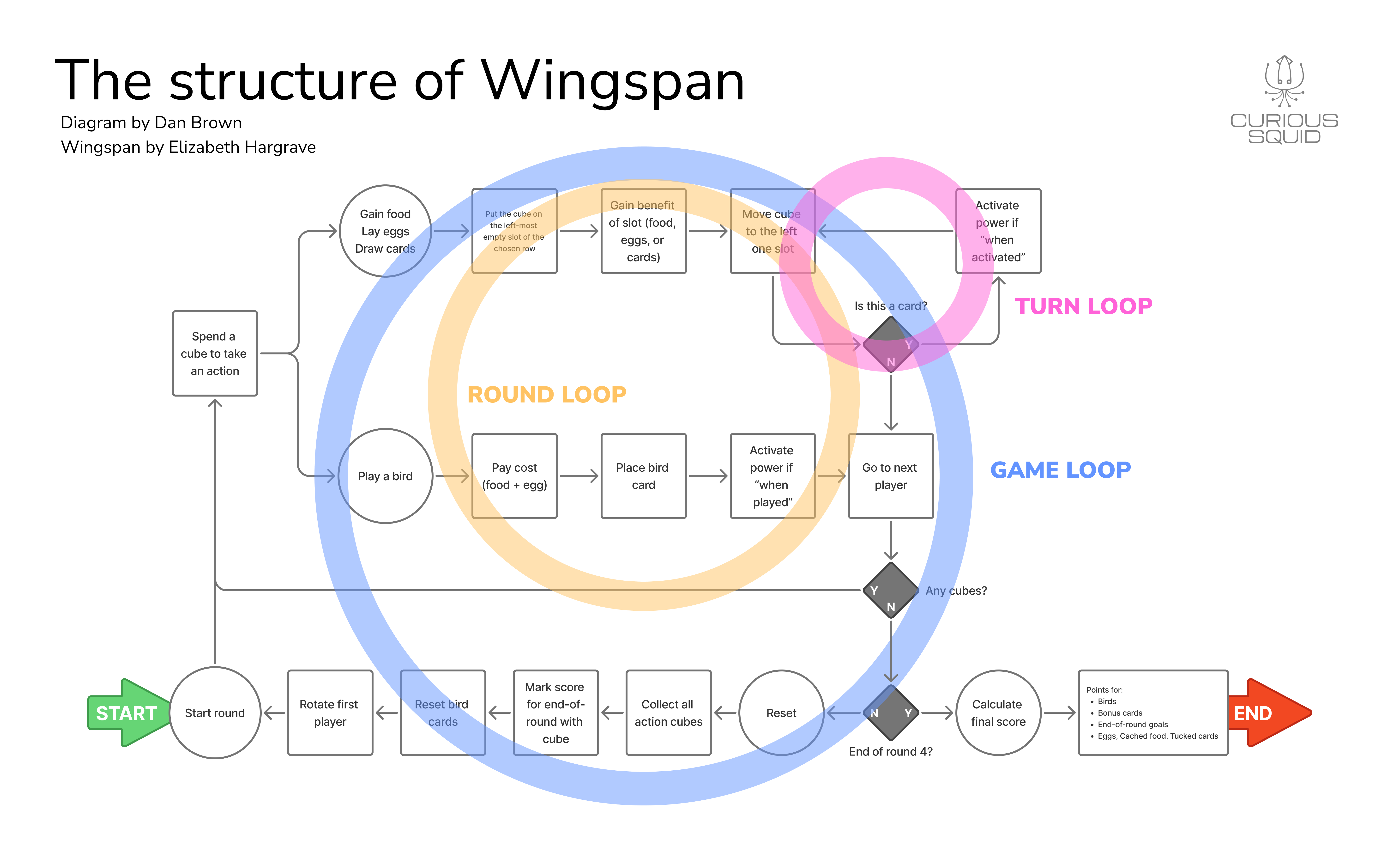
For my part, I diagrammed the “game loop,” the series of steps that players go through on their turn to play the game.
In a game like Monopoly, the game loop is simple: roll dice, move token, deal with consequences of target space (e.g. pay rent, draw card, etc.) The loop for Wingspan is much more complicated. In part this is because, unlike Monopoly, the player has real choices to make. But it is also complicated because there are more steps and conditions.
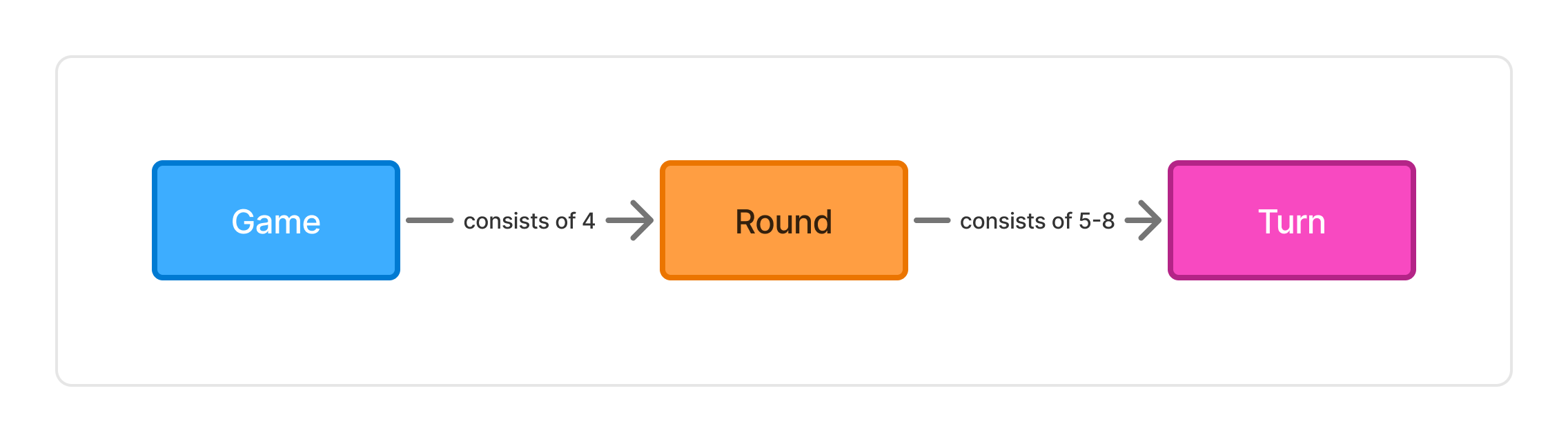
When I started dissecting Wingspan I found three nested (pun intended) loops:
The overall game loop is that the players play a series of four rounds.
The round loop is that players play a series of turns and then calculated their accrued score
The turn loop is that players either play a card or execute the instructions on some of their cards
This got me thinking about how the game engages players in these loops.
Players won’t experience the overall game loop – the rhythm of the game – until they’ve played one full round, so not immediately.
Players won’t truly experience the turn loop until they have played a few turns and have some cards that interact with each other. The first few turn loops might even feel a little confusing because they seem pointless until there are more cards on the board.
The first loop that players experience is the round loop. That is, they go around the table a few times, playing cards and activating birds. This is the only loop they really feel at the beginning of the game. They’re doing the other loops, but they don’t really feel those loops. They feel the round – doing an action, then passing to the next player – but it’s only once they’ve done a few rounds will those other loops make sense.
It’s not lost on me that a round is conceptually bigger than a turn and conceptually smaller than the game – it’s the middle layer. So, Wingspan onboards players through the middle loop.
Is that on purpose, or is it just a consequence of the design of the game? That is, perhaps the game designer decided the best way to learn the game was to experience that middle loop first.
Games are information systems. Players are users of those information systems. When they’re first learning the information system, they are not aware of everything it can do or all the information it contains. With a game like Wingspan, the player needs to learn answers to questions they don’t know they have:
What are the range of effects a bird card can have?
What are the different possible values for the category of “nests”?
Why should I pay attention to the nest type or the bird’s wingspan?
(Compare to chess, for example, where all the information in the entire game is contained on the board.)
Good systems engage users in a way that helps them understand everything they can do, everything that is available. This understanding may take time. Completing a single game of Wingspan gives you tremendous insight about the information it contains, but it is still an incomplete understanding.
We’ve observed that this information system consists of nested “experience loops” and that one of these loops is the first thing that users really experience. We can’t draw a conclusion from this observation, generalizing about designing information systems. But we can use the observation as the basis for prompts – what I call lenses – to help us think through design problems.
Lens of Loops
If you were to model your product’s experience as a loop, what would it look like? What are the repeated steps users take each time they use the product?
Lens of Onboarding
What is the right part of the structure to onboard users?
Lens of Visibility
At what point in the user’s experience do they come to fully see other parts of the structure?
Lenses help designers look at their work critically. Lenses don’t tell us what to design. They don’t establish guardrails for the design process. They don’t give us a north star. Instead, lenses give us ways to interrogate our own design work, to look at it critically from a novel perspective. Building this diagram of Wingspan allowed me to see the game itself – and games of its ilk – in a new way.
Wingspan is often billed as a very accessible game – perhaps because of its theme – but if you’re not used to games like this, it seems opaque and uncomfortable. I showed an early version of this diagram to my friend Kenji, also an avid gamer, and he said, “I think you just identified why so many people struggle with this game.”
Thanks for reading!
Spilling Ink is the (sorta) monthly newsletter from from Curious Squid, Dan Brown’s IA and UX design agency based in Washington, DC.
Unchecked is the monthly podcast about disinformation and the role designers must play in creating more resilient information spaces.